Karttasovellukset Internetissä

Bittisotaa.

Norse – Superior Attack Intelligence
Norse maintains the world’s largest dedicated threat intelligence network. With over eight million sensors that emulate over six thousand applications – from Apple laptops, to ATM machines, to critical infrastructure systems, to closed-circuit TV cameras - the Norse Intelligence Network gathers data on who the attackers are and what they’re after. Norse delivers that data through the Norse Appliance, which pre-emptively blocks attacks and improves your overall security ROI, and the Norse Intelligence Service, which provides professional continuous threat monitoring for large networks.

Contact Norse today to see how we can help at [email protected].

http://map.norsecorp.com/#/
 
Maapallon säätila.

http://earth.nullschool.net/
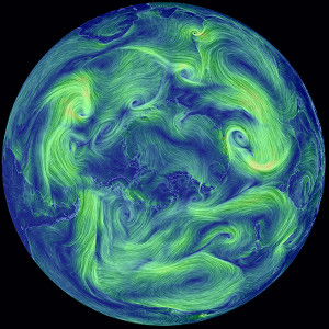
a visualization of global weather conditions

forecast by supercomputers

updated every three hours


ocean surface current estimates

updated every five days


ocean surface temperatures and

anomaly from daily average (1981-2011)

updated daily


ocean waves

updated every three hours

purchase artwork from Point.B Studio to help support this site

Community |

Facebook Page

Author |

Cameron Beccario @cambecc

Free Version of Source |

github.com/cambecc/earth

Modules |

D3.js, backbone.js, when.js, node.js

Weather Data |

GFS (Global Forecast System)
NCEP / National Weather Service / NOAA

Ocean Currents Data |

OSCAR
Earth & Space Research

Sea Surface Temperature |

Real Time Global SST
MMAB / EMC / NCEP

Waves |

WAVEWATCH III
MMAB / EMC / NCEP

Aerosols and Chemistry |

GEOS-5 (Goddard Earth Observing System)
GMAO / NASA

GRIB/NetCDF Decoder |

UCAR/Unidata THREDDS

Geographic Data |

Natural Earth

Hosting |

CloudFlare, Amazon S3

Font |

M+ FONTS, Mono Social Icons Font

Color Scales |

chroma.js
ColorBrewer2.org
Kindlmann Linear Luminance
MYCARTA
Dave Green's cubehelix

Waterman Butterfly |

watermanpolyhedron.com

Earlier Work |

Tokyo Wind Map

Inspiration |

HINT.FM wind map

atmospheric pressure corresponds roughly to altitude

several pressure layers are meteorologically interesting

they show data assuming the earth is completely smooth

note: 1 hectopascal (hPa) ≡ 1 millibar (mb)

1000 hPa |

~100 m, near sea level conditions

850 hPa |

~1,500 m, planetary boundary, low

700 hPa |

~3,500 m, planetary boundary, high

500 hPa |

~5,000 m, vorticity

250 hPa |

~10,500 m, jet stream

70 hPa |

~17,500 m, stratosphere

10 hPa |

~26,500 m, even more stratosphere

the "Surface" layer represents conditions at ground or water level

this layer follows the contours of mountains, valleys, etc.


overlays show another dimension of data using color

some overlays are valid at a specific height

while others are valid for the entire thickness of the atmosphere

Wind |

wind speed at specified height

Temp |

temperature at specified height

TPW (Total Precipitable Water) |

total amount of water in a column of air
stretching from ground to space

RH |

relative humidity at specified height

WPD (Wind Power Density) |

measure of power available in the wind

TCW (Total Cloud Water) |

total amount of water in clouds
in a column of air from ground to space

3HPA |

Next 3-hour Precipitation Accumulation:
total amount of precipitation over the next three hours

MSLP (Mean Sea Level Pressure) |

air pressure reduced to sea level

MI (Misery Index) |

perceived air temperature
combined heat index and wind chill

SST (Sea Surface Temp) |

temperature of the ocean surface

SSTA (Sea Surface Temp Anomaly) |

difference in ocean temperature from
daily average during years 1981-2011

Peak Wave Period |

period of most energetic waves,
whether swells or wind generated

HTSGW (Significant Wave Height) |

roughly equal to mean wave height
as estimated by a "trained observer"

COsc (CO Surface Concentration) |

the fraction of carbon monoxide present
in air at the earth's surface

CO2sc (CO2 Surface Concentration) |

the fraction of carbon dioxide present
in air at the earth's surface

SO2sm (Sulfur Dioxide Surface Mass) |

amount of sulfur dioxide in the air near
the earth's surface

DUext (Dust Extinction) |

the aerosol optical thickness (AOT) of
light at 550 nm due to dust

SO4ext (Sulfate Extinction) |

the aerosol optical thickness (AOT) of
light at 550 nm due to sulfate

about ocean waves

Significant Wave Height is the average height of the highest 1/3 of waves at a particular point in the ocean. There's a great writeup here describing what this means.

Peak Wave Period is the (inverse) frequency of the most energetic waves passing through a particular point, whether wind generated or swells. Certainly, there are many more groups of waves moving through an area, each in different directions, but trying to show them all rapidly becomes complex. Instead, we show the one wave group contributing the most energy. This has the effect, though, of creating "boundaries" between regions of ocean where the #1 wave group suddenly switches to second place. Often these boundaries represent swell fronts, but other times they are just artifacts of the ranking mechanism.

about CO2 concentrations

While implementing the visualization of CO2 surface concentration, I noticed the NASA GEOS-5 model reports a global mean concentration that differs significantly from widely reported numbers. For example, from the run at 2015-11-23 00:00 UTC, the global mean is only 368 ppmv whereas CO2 observatories report concentrations closer to 400 ppmv. GEOS-5 was constructed in the 2000s, so perhaps the model does not account for accumulation of atmospheric CO2 over time? This is simply speculation. I'm just not certain.

To bring the GEOS-5 results closer to contemporary numbers, I have added a uniform offset of +32 ppmv, increasing the global mean to 400 ppmv. This is not scientifically valid, but it does allow the visualization to become illustrative of the discussion occurring today around atmospheric CO2. Without question, I would welcome a more rigorous approach or an explanation why the GEOS-5 model produces the data that it does.

disclaimer

GEOS-5 data (covering all Chem and Particulates layers) comes with the following disclaimer: Forecasts using the GEOS system are experimental and are produced for research purposes only. Use of these forecasts for purposes other than research is not recommended.

about aerosols and extinction

An aerosol is air containing particles. Common particles are dust, smoke, soot, and water droplets (clouds). These particles affect sunlight primarily through absorption and scattering, which combine to reduce the amount of light reaching the ground. This loss of light as it passes through the atmosphere is called extinction.

One common measure of extinction is aerosol optical thickness (AOT), which is (the log of) the ratio between the power of incoming light and the power of transmitted light. This helps us understand how "thick" the air is with particulates.

keyboard shortcuts

e |

show the menu

escape |

close dialog/menu

k |

go forward one time step

shift-k |

go forward eight time steps

j |

go backward one time step

shift-j |

go backward eight time steps

n |

go to now (the most recent data)

i |

go up one pressure level

shift-i |

go up to the stratosphere

m |

go down one pressure level

shift-m |

go down to the surface

g |

toggle the grid on/off

p |

toggle the animation on/off


The GEOS-5 data used on this site have been provided by the Global Modeling and Assimilation Office (GMAO) at NASA Goddard Space Flight Center through the online data portal in the NASA Center for Climate Simulation

weather and ocean data are generated from numerical models

earth.nullschool.net implies no guarantee of accuracy

Copyright (c) 2016 Cameron Beccario
 
http://paikkatieto.ymparisto.fi/ves...525/virtualdirectory/Resources/Config/Default

Lähivesien tilaa voi tarkastella Vesikartta-palvelussa
RAUMA JA ALUE · 2.5.2016 KLO 20:55
FACEBOOK1 TWITTER

Mökkikausi on käynnistynyt, ja tieto lähivesien tilasta kiinnostaa. SYKEn Vesikartta-palvelusta voi tarkastella mökkijärven tai -joen tilaa melko kattavasti.

Suuri osa maamme pintavesistä on ekologiselta tilaltaan erinomaisia tai hyviä: 65 % joista, 85 % järvistä ja 25 % rannikkovesistä.

Vesikartalta voi tarkastella pintavesien tilan ja tyypittelyn lisäksi pohjavesiä. Palvelusta on saatavilla myös tietoa vesiä kuormittavasta toiminnasta, kunnostustoimista ja meriympäristön seuranta-asemista. Vesikartasta löytyy kotimaisten aineistojen lisäksi Norjan ja Ruotsin pinta- ja pohjavesien tilatietoja.

Tiedot perustuvat ELY-keskusten, SYKEn ja entisen Riista- ja kalatalouden tutkimuslaitoksen (nyk. Luke) seuranta-aineistoihin
 
Jokien valuma-alueita.


These Colorful Maps Show That River Basins Are Surprisingly Interesting
http://www.iflscience.com/environme...at-river-basins-are-surprisingly-interesting/

http://imgur.com/gallery/yLCLD

ai0SrNq.jpg
 
Lähes koko Suomen kattava MapAnt-niminen karttapalvelu, jonka tarkkuus yltää lähes suunnistuskarttojen tarkkuuteen (pikseli on 1,4m x 1,4m):
Juttu http://www.mikrobitti.fi/2016/12/uusi-supertarkka-nettikartta-lahes-koko-suomesta/ kertoo että
Suunnistajakolmikko Jarkko Ryyppö, Mats Troeng ja Joakim Svensk on rakentanut Maanmittauslaitoksen avoimesta kartta-aineistosta lähes koko Suomen kattavan MapAnt-nimisen karttapalvelun, jonka tarkkuus yltää lähes suunnistuskarttojen tarkkuuteen. Tarkimmalla zoomaustasolla kartta on maastonmuotojen osalta selvästi tarkempi kuin esimerkiksi Metsähallituksen tarjoama Retkikartta tai Maanmittauslaitoksen oma Karttapaikka.
Uusi karttapalvelu perustuu Ryypön kehittämään Karttapullautin-sovellukseen, jolla voi yhdistää Maanmittauslaitoksen maastotietokannan ”peruskartta-aineiston” ja laserkeilausaineiston ja muodostaa niistä tarkat korkeuskäyrät ja kasvillisuustiedot sisältäviä karttoja. Tällainen ”pullautuskartta” soveltuu suunnistusharjoittelun lisäksi kaikenlaisiin tarpeisiin, joissa maastonmuotojen ja kasvillisuuden tarkkuus on olennaista.

MapAntissa kartoista muodostuu vaikuttava kokonaisuus, jossa on hauska ”lennellä” ympäri Suomea laskeutuen välillä alemmas tarkastelemaan pienempiä kohtia ja välillä nousten ”yläilmakehään” ihailemaan koko valtakuntaa.
Jos haluaa nähdä kartasta oman sijaintinsa tai lisätä karttaan reittimerkinnän (gpx-muotoinen tiedosto), niin palvelua pitää käyttää toiselta palvelimelta.
MapAntista voi myös tallentaa kartan osia omalle koneelle (tallentuvat png- tai kmz-muodossa).
Ison työn ovat tekijät tehneet, jutun mukaan "100 konetta jauhoi karttaa kolme viikkoa".
 
Hirsimökkikauppiaille vinkkejä.


http://sos.noaa.gov/Datasets/dataset.php?id=643
Description

This animation shows every recorded earthquake in sequence as they occurred from January 1, 2001, through December 31, 2015, at a rate of 30 days per second. The earthquake hypocenters first appear as flashes then remain as colored circles before shrinking with time so as not to obscure subsequent earthquakes. The size of the circle represents the earthquake magnitude while the color represents its depth within the earth. At the end of the animation it will first show all quakes in this 15-year period. Next, it will show only those earthquakes greater than magnitude 6.5, the smallest earthquake size known to make a tsunami. Finally it will only show those earthquakes with magnitudes of magnitude 8.0 or larger, the "great" earthquakes most likely to pose a tsunami threat when they occur under the ocean or near a coastline and when they are shallow within the earth (less than 100 km or 60 mi. deep).

This time period includes some remarkable events. Several large earthquakes caused devastating tsunamis, including 9.1 magnitude in Sumatra (26 December 2004), 8.1 magnitude in Samoa (29 September 2009), 8.8 magnitude in Chile (27 February 2010), and 9.0 magnitude off of Japan (11 March 2011). Like most earthquakes these events occurred at plate boundaries, and truly large events like these tend to occur at subduction zones where tectonic plates collide. Other, much smaller earthquakes also occur away from plate boundaries such as those related to volcanic activity in Hawaii or those related to wastewater injection wells in Oklahoma.

You can view a YouTube version of this animation here.

Notable Features

  • The great majority of earthquakes occur at tectonic plate boundaries.
  • The majority of great earthquakes (magnitude 8.0 or larger) are megathrust earthquakes that occur at convergent plate boundaries, also called destructive margins or subduction zones.
  • For an earthquake to pose a tsunami hazard it needs to vertically move the seafloor; therefore it needs to be large (typically 8.0 or larger), under or near the ocean, and shallow within the earth (less than 100 km).
  • During the 15-year period covered by this animation 20 earthquakes had a magnitude of 8.0 or larger:
    • June 23, 2001, MW = 8.4, near coast of southern Peru
    • September 25, 2003, MW = 8.3, Hokkaido, Japan
    • December 23, 2004, MW = 8.1, north of Macquarie Island (south of New Zealand)
    • December 26, 2004, MW = 9.1, northern Sumatra and Andaman Islands
    • March 28, 2005, MW = 8.6, northern Sumatra, Indonesia
    • May 3, 2006, MW = 8.0, Tonga
    • November 15, 2006, MW = 8.3, Kuril Islands, Russia
    • January 13, 2007, MW = 8.1, east of Kuril Islands, Russia
    • April 1, 2007, MW = 8.1, Solomon Islands
    • August 15, 2007, MW = 8.0, near coast of central Peru
    • September 12, 2007, MW = 8.4, southern Sumatra, Indonesia
    • September 29, 2009, MW = 8.1, Samoa Islands
    • February 27, 2010, MW = 8.8, offshore of central Chile
    • March 11, 2011, MW = 9.1, near the east coast of Honshu, Japan
    • April 11, 2012, MW = 8.6, off the west coast of northern Sumatra, Indonesia
    • April 11, 2012, MW = 8.2, off the west coast of northern Sumatra, Indonesia
    • February 6, 2013, MW = 8.0, west of Lata, Solomon Islands
    • May 24, 2013, MW = 8.3, Sea of Okhotsk, Russia
    • April 1, 2014, MW = 8.2, northern Chile
    • September 16, 2015, MW = 8.3, central Chile
 
NETTIPALVELUT

Ari Karkimo

Tässäkö netin uusi hittipalvelu? Tuo maailman kotiisi

Kiinnostaako tietää, millaisia radio-ohjelmia muualla kuunnellaan? Maailma on täynnä nettiradioita, mutta niiden kaiveleminen voi olla työlästä. Radio Gardenkaivaa ne esiin hauskasti ja näppärästi.

Palvelun käyttöliittymä on erittäin luonnollinen: maapallon kartta. Kartalta etsitään kolkka, jonka radio-ohjelmaa haluaa kuunnella. Radioasemat näkyvät vihreitä täplinä, ja kuuntelemaan pääsee pallukkaa klikkaamalla.

Techcrunch kirjoittaa, että palvelu on syntynyt saksalaisessa Martin-Luther -yliopistossa Golo Föllmerin projektin tuloksena.

”Radio yhdistää ihmisiä tuomalla kaukaiset äänet lähelle. Alusta lähtien radiosignaalit ovat ylittäneet rajat”, Föllmer toteaa.

http://radio.garden/live/
 
http://www.visualcapitalist.com/int...&utm_medium=social&utm_campaign=SocialWarfare

Interactive: Mapping the Flow of International Trade
The interactive visualization you see in this post was created by data visualization expert Max Galka from theMetrocosm blog. (Also check out his new project, Blueshift, which allows users to upload data and visualize it on maps with no coding required.)

Trade is an essential part of economic prosperity, but how much do you know about global trade?

Today’s visualization helps to map international trade on a 3D globe, plotting the exchange of goods between countries. It enables the abstract concept of trade to become more tactile, and at the same time the visuals make it easier to absorb information.
 
Kartta linkkimastoista, joita ressu voi vartioida vapaa-aikoinaan speznatsien varalta. :)

Cellmapper lähestyy ongelmaa astetta teknisemmin ja vaikeaselkoisemmin, mutta täydentää sopivasti Nettitutkan hieman ylimalkaisia tuloksia. Cellmapperin kartasta voi tutkia lähimpi tukiasempia ja tarkistaa, mihin suuntaan kunkin operaattorin antennit on suunnattu ja miten niiden alla olevat ”solut” levittyvät maastoon, eli käytännössä voi tsekata, minkä operaattorin peitto parhaiten osuu parhaiten oman kodin kohdalle.


Cellmapper näyttää kunkin operaattorin antenneiden suuntauksen tukiasemalta.
Meitä lähinnä olevalta mastolta DNA oli suunnannut antenninsa osoittamaan viereisen Porvoon moottoritien suuntaisesti, mikä on aika yleistä pääväylien varrella. DNA:lla oli meidän tukiasemalla käytössä 1800 MHz:n taajuusalue, eli luvassa olisi parhaimmillaan 150 Mbit/s -nopeudella toimiva yhteys. 2600 MHz:llä voisi teoriassa päästä jopa 300 Mbit/s -nopeuteen, mutta sitä herkkua on toistaiseksi vain hyvin harvoissa paikoissa, eikä taatusti täällä metsän ja pellon välissä.
http://www.mikrobitti.fi/2017/04/nain-hankin-kotiin-nopeamman-ja-halvemman-nettiyhteyden/

https://www.cellmapper.net/map
 
https://kuluttaja.fi/musta-lista/

Vältä näitä yrityksiä
Mustalla listalla mainitut yritykset eivät ole noudattaneet kuluttajariitalautakunnan suositusta siitä, miten niiden pitää hyvittää virheensä kuluttajalle. Suosittelemme välttämään tällaisia yrityksiä.

Julkaisemme Mustan listan tapaukset kartalla vuodesta 2014 eteenpäin. Tapaukset voivat olla sitä vanhempia, sillä riitojen käsittely kuluttajariitalautakunnassa kestää useita kuukausia. Päätöksen jälkeen yrityksille annetaan vielä kuukausia aikaa noudattaa suositusta.

Kuluttaja toimittaa Mustan listan itsenäisesti kuluttajariitalautakunnan julkisista asiakirjoista. Listan luvaton kopiointi ja julkaisu muualla on kiellettyä. Jos haluat jakaa tietoa muualla, voit julkaista linkin tälle sivulle.

Yrittäjä: jos listalla on mielestäsi virhe, lue ohjeet täältä.

Lisää kuluttajariitalautakunnan ratkaisuja eri aiheista voit lukea Ratkaisuja riitoihin -osiosta.
 
Back
Top